Ecommerce Homepage Design Tips for Creative Small Businesses
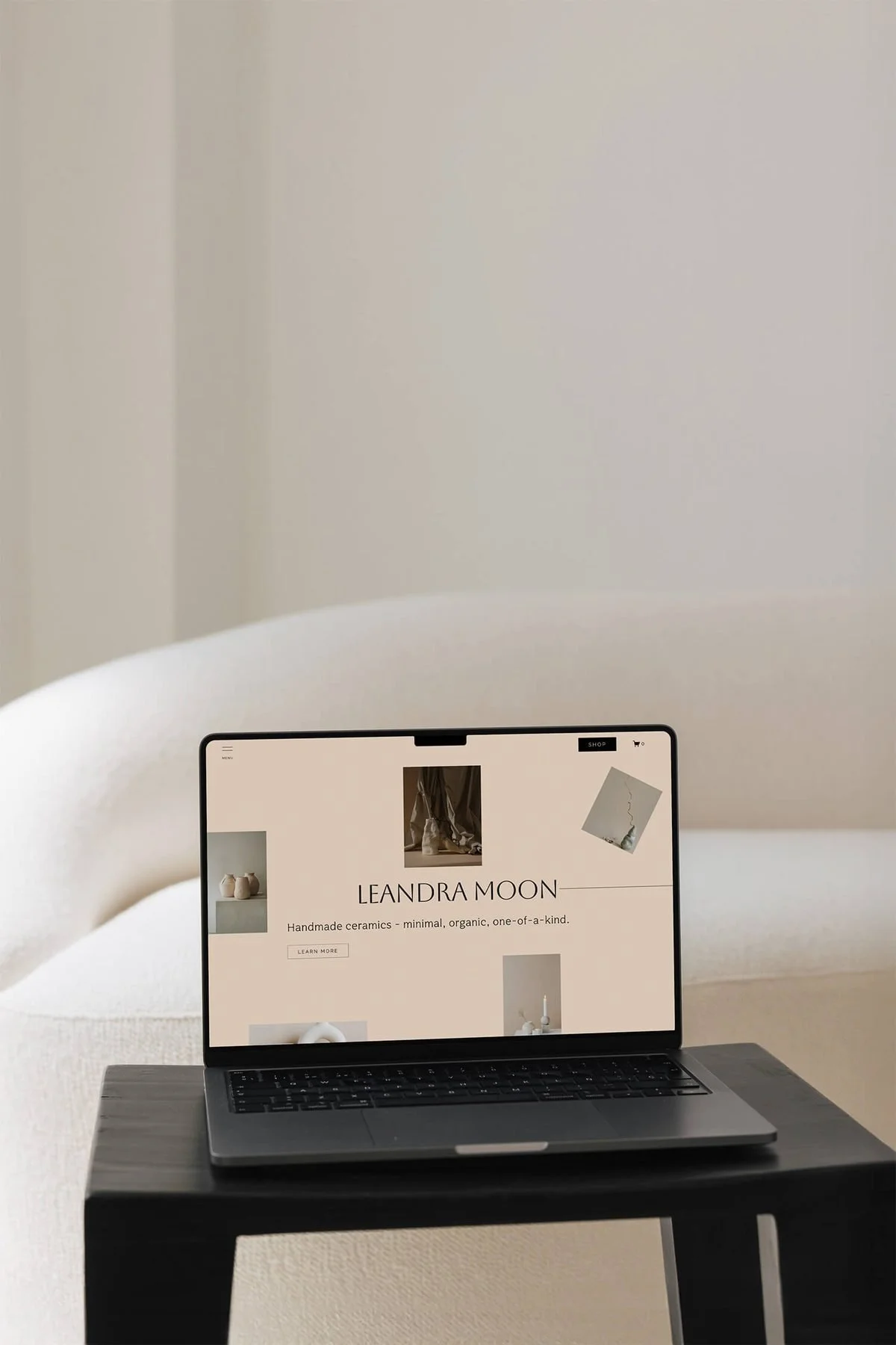
A well-designed homepage does a lot of the heavy lifting for your online business. It's your chance to build trust and connection with a customer before they've read a single product description. This is exactly why the right ecommerce homepage design tips for your specific business matter so much.
When I was running my own made-to-order clothing label, most ecommerce homepage best practices I found were written for big brands with an in-house dev team, a substantial marketing budget, and hundreds of products. A different reality entirely to running things solo with a small, curated catalogue.
Many of us also run non-standard business models: made-to-order, waitlists, limited drops, bespoke pieces, or a hybrid of product alongside studio visits, workshops, or classes. We want to translate the same care we put into our handmade work into our websites too, but when the advice out there doesn't quite fit, it's easy for that process to become overwhelming.
The differences come down to a few things. A small product range calls for a different ecommerce homepage layout logic than a massive inventory. Trust isn't built through review volume or badges alone but from sharing your story, your process, the connection between the person who makes the product and the person who buys it. And good homepage design should ultimately also be easy to maintain and adapt over time, so you can get back to making awesome, beautiful, unique products.
Table of Contents
Above the Fold: First Impressions
1. Simplify Your Homepage Navigation
It's easy to get carried away adding everything you offer into your navigation. You care about all of it, and you want people to know. But navigation exists to guide a customer toward what matters most and help them find it easily.
For most ecommerce, that's the shop or a specific product. For artisan and maker businesses, it might also mean booking a studio visit, or downloading a guide to your bespoke order process.
The real question is: what do you want a visitor to do on your site? Book a visit? Land on a specific product? Understand your made-to-order process? Let your navigation follow from that goal — informed by knowing your ideal customer intimately, how they move through your site and what they're looking for.
As a rule of thumb, keep it to seven items or fewer. And don’t get too experimental with design: people already have expectations of how ecommerce sites work, and there's a reason that best practices exists. Even if your business operates nothing like a big box brand, keeping navigation where customers expect it is a smart design choice. Familiarity here is a gift, not a compromise. And on mobile, double-check every menu item is tappable, with no overlap (see also tip 9 about mobile friendly design).
2. Lead with a personal value proposition
They say you only get one chance to make a first impression, and nowhere is that truer than on a website. With attention spans sadly ever diminishing, the content above the fold — i.e. the content visible before anyone scrolls, and often also referred to as the Hero banner — has to work hard. The exact above the fold area varies by screen size, but the principle holds: prioritise the essentials at the very top.
The big-brand version of this often leads with cold, hard benefits like “free shipping”, “30-day returns”, or “10% off”. You can certainly use these too, but for a handmade product business, it is much more important to clearly tell your customer what you make, who it is for, and why it’s worth their time and money.
Here, we are speaking to something more intangible than a discount, something that touches on the innate human need for and connection to craft and art. Use five to twelve words in plain, descriptive language your ideal customer actually understands and would search for. As much as I personally like word-y prose, this isn't the place for abstract or poetic phrasing.
In many ways, a customer isn't just buying your product. They're investing in another human being who has, in turn, invested time, energy, attention and money in learning a skill to make something beautiful and meaningful that should bring pleasure and use for years to come. Your top section needs to let them feel that, straight away.
3. Choose a strong hero image
As highlighted in the tip above, the content above the fold is prime website real estate. This is often the first time a customer sees your product. The image (or images) you choose here need to firmly establish your brand and essentially convey in visual form what you put down in writing in tip 2.
Big commerce often leans on aspirational lifestyle photography or a rotating carousel to show a variety of products (the latter I strongly counsel against, since it can be extremely distracting).
You absolutely can and should include lifestyle imagery on your site,. However, for a maker, highlighting that this isn't a mass-produced object is a true differentiator and the visuals in your Hero section should support and reinforce that point. That could mean showing the product amongst its materials, or mid-process, or just simple but high-quality product shots of your star item. It needs to speak to something beyond just aspiration and that is something polished lifestyle photography doesn't always convey.
The products you make may stay with someone for many, many years and the images in the Hero section are your visual chance to answer the question why your customer should spend money on this particular object.
For makers, authenticity and closeness to the customer is what sets you apart from ecommerce giants. If you buy from a big name brand, it is simply not possible to know the person who laboured over the product. What makes you different is that you are not only the person running the business, you are the artisan who makes the product. Use that powerful brand distinction and let your hero images help you speak to that to your customer.
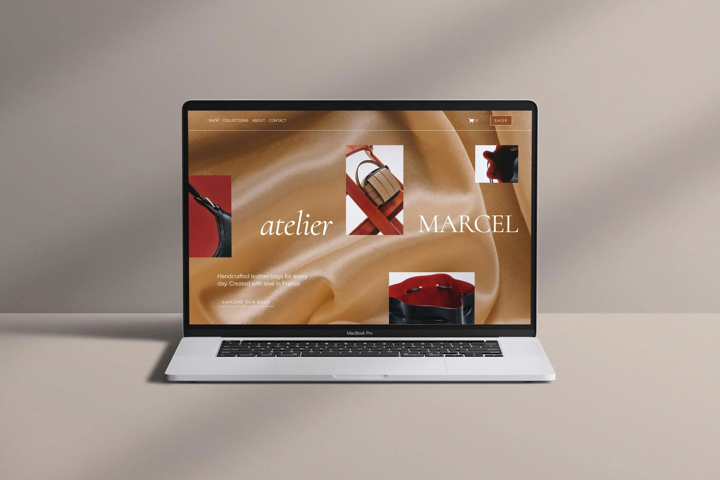
A concept homepage built on my Leandra Moon base design for Atelier Marcel, a fictional handcrafted leather goods brand. Simple navigation, a clear value proposition, and strong hero images create a distinctive first impression.
As They Scroll: Making Your Case
4. Curate your product selection
Further down the homepage, you get more room to showcase product and it's tempting to want to show everything, even with a relatively small catalogue. But the same principle from the tips above apply: focus creates connection.
Rather than a wide spread, choose a small number of products — sometimes just one — and let the story around it do the work. The material. Your process. The details that make it distinct. Think of this like a well-curated shop window that is shining the spotlight on one particular item or category of products.
If you make ceramic mugs, for instance, feature your best-seller and show its construction and character through a handful of images, rather than laying out every mug you make. This is another chance to guide the visitor along the path your website goals have set. If your goal is to sell more of a specific piece, this is where you make the case for it. And it doesn't need to be static: rotate seasonally, showcase limited editions, or a new collection launch. Keeping images fresh and relevant across the site is actually another good best practice.
5. Build trust through story, not just reviews
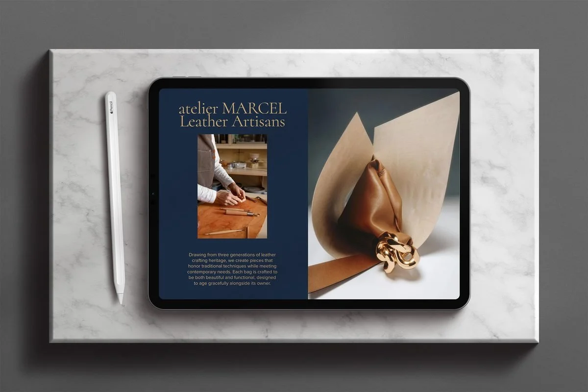
A concept "About" section for Atelier Marcel, pairing a maker-at-work photo with a short heritage story alongside a striking product close-up. This is the kind of process and story content that helps build trust and connection with your customers.
Social proof matters for a small handmade business too but the standard approach of a review counter and "as seen in" trust badges doesn't always carry the same weight on their own. As a customer, you're much closer to the maker here, and ideally you get a glimpse into how the thing you're looking at actually comes to be.
For a maker, this part of the homepage might include behind-the-scenes images, notes on sourcing and materials, a word from the founder; anything that deepens the connection and helps a customer understand why this product is worth the investment. Reviews still matter. They're just one lever among several, and for small-scale artisans, the story behind the product often does more of the trust-building work than review volume ever could.
6. Design honest marketing cues
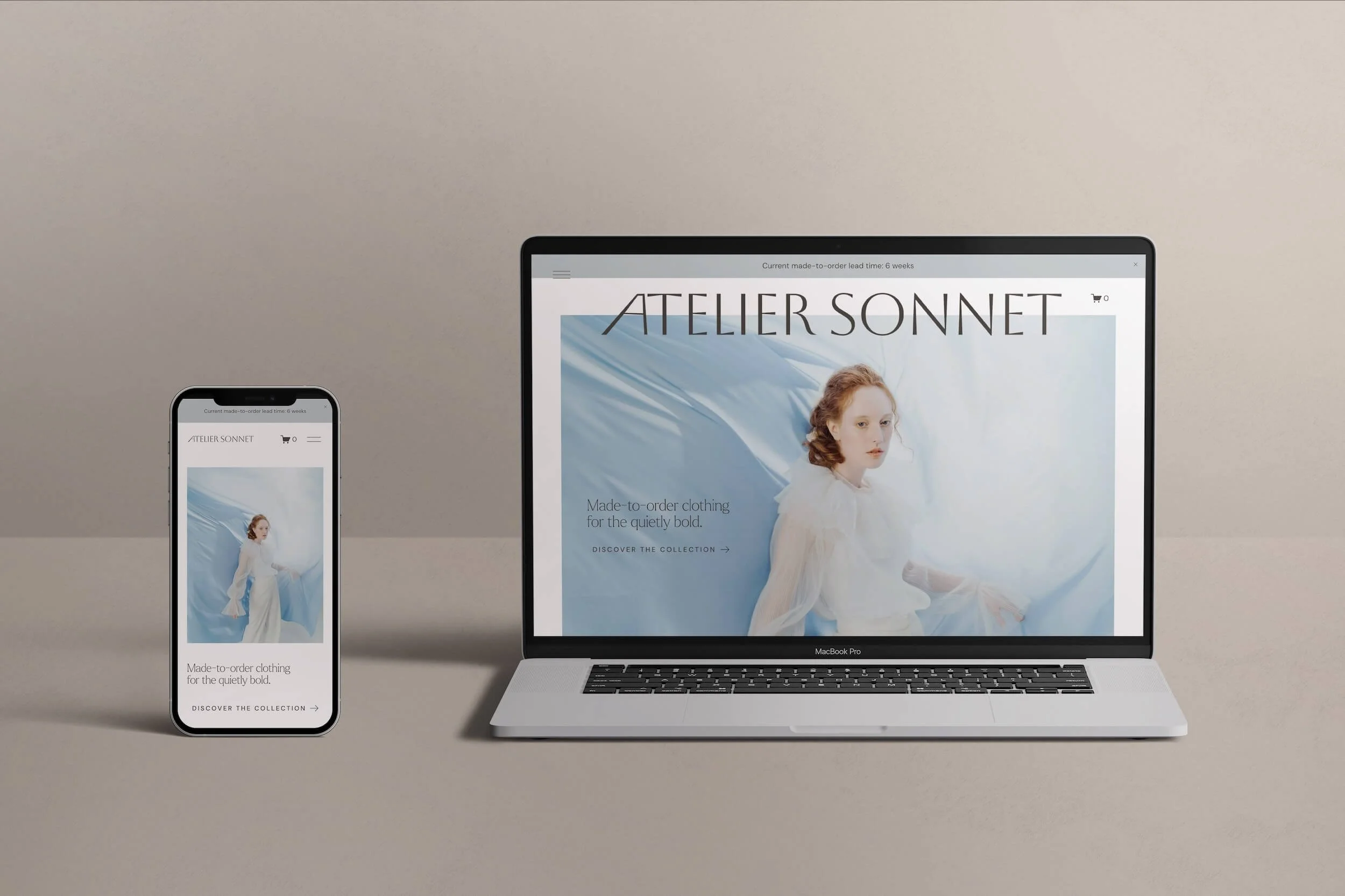
A concept homepage for Atelier Sonnet, a made-to-order clothing brand. A slim announcement bar states the current made-to-order lead time plainly, on both desktop and mobile, giving customers honest information upfront in a calm, clear way.
Countdown timers, flashing "only 2 left!" badges, endless promo pop-ups. This is the usual big-brand playbook for urgency, and it sits uneasily and feels at odds with a more considered, values-centred brand.
But scarcity doesn't have to mean manufactured pressure. For a made-to-order or limited-run business, scarcity is often a fact — and when it is, there are calm, well-designed ways to communicate it that feel honest and informative without overwhelming website visitors.
For example, use a small visual cue like a “limited availability" tag on a featured product. Or an announcement bar at the very top of your homepage stating your current made-to-order lead time, so a customer knows what to expect before they've even started browsing. Or a slim, understated marquee above a product section, marking a special or seasonal run.
Small independent businesses have real power to shape how people think about consumption and how you design these cues on your website is a meaningful part of that.
Note: these cues can live in more than one spot — an announcement bar near the top, a badge mid-page — so this one doesn't sit in a single fixed location
Guiding Their Next Step
7. Use one clear Call to Action
Similar to navigation and product features, it's tempting to want your buttons to draw attention to everything at once: the shop, book a studio visit, join a waitlist, sign up for the newsletter. That quickly becomes confusing, and defeats the purpose of having a CTA (call to action) at all. Ideally, there is one primary action on the homepage — or at the very least, only one for every major section of the page.
The visual weight of these buttons matters too. Enough contrast to guide the eye (which also matters for accessibility), clear placement so they're not lost among text and imagery, and copy that says exactly what will happen when a user clicks: "Shop the Collection", "Book a Consultation", “Fill out the Inquiry Form”.
If your business has multiple arms — product and service, ready-made and bespoke — resist the urge to CTA everything at once. Go back to your goals for the site and ask: what's the primary next step I want this visitor to take? The answer to that becomes your main call to action.
Before They Leave: The Footer
8. Add a simple way to stay in touch
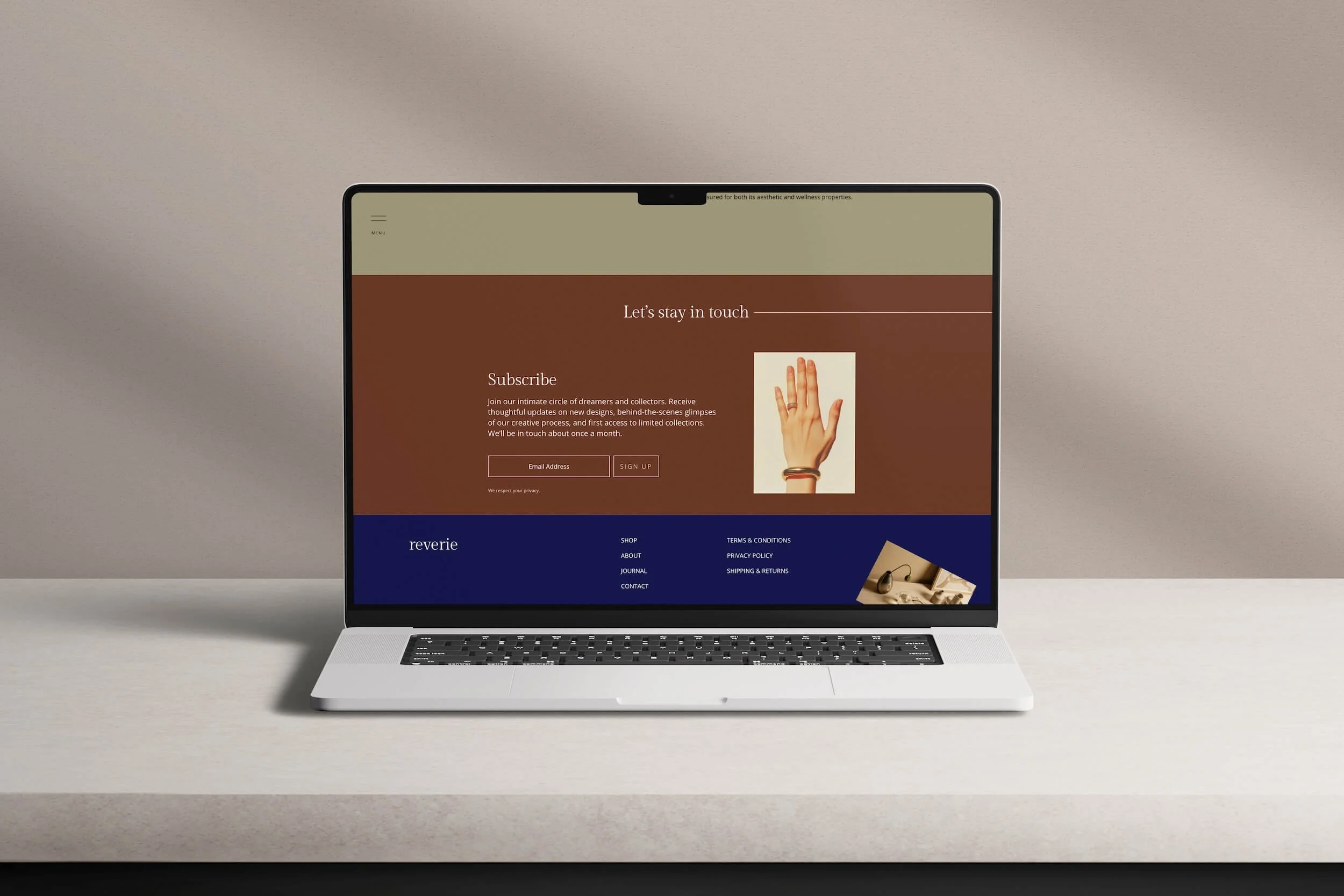
A newsletter section for Reverie, a concept fine jewellery brand, built on my Leandra Moon base design. Set into the footer just above the site links, it makes a clear, honest offer — early access, occasional behind-the-scenes updates, once a month — and it reaches visitors on every page, not just the homepage
Tying into honest marketing cues: somewhere on your site, there's a natural place to invite people to stay in touch. I don't recommend a pop-up for this. It’s intrusive to the browsing experience, and I think a lot of visitors find it off-putting too.
Instead, give it a small, well-designed section of its own, ideally in your footer (the part of your page that repeats across every page on your website). That's actually why I recommend the footer specifically: it means the invitation gets seen by customers across your entire site, not just the homepage, giving it a much better chance of being noticed.
And the great thing about an email list is that, unlike social media, it's yours. No algorithm decides who sees it, no platform that changes the rules overnight. It's one of the very few places where you have full, direct ownership of the relationship with your customer (as you can probably guess, your website is another one).
Keep the invitation simple and honest, both visually and in terms of the text you use. For the sign-up form, stick to a clean layout and if possible, use name and email field only. Be clear about what people are signing up for, and roughly how often they'll hear from you; a sentence or two is enough. In short: say exactly what will happen when someone clicks that subscribe button.
Principles That Apply Throughout
9. Make it mobile-friendly
It won't surprise you that most people access the internet from their phones now, shopping included. So your homepage needs to hold up on a smaller screen: thumb-friendly navigation, fast-loading images, a condensed menu, a layout that flows naturally in a narrower view.
Test on an actual phone before you publish and not just a resized browser window. If you're on Squarespace, the built-in mobile preview tools are really good, and you can now show or hide specific content by device, which makes the mobile experience much easier to get right.
10. Make It easy to update yourself
This point is often overlooked, especially by small solo business owners: your homepage (and website overall) should be easy for you to update, not just for a customer to browse. You shouldn't need to call in a web designer for every small seasonal change.
I believe strongly in autonomy over your own business infrastructure. So much of running a small business today is dictated by platforms and algorithms you don't control. A website is one of the few places you can have ownership over your content. That means focusing on content blocks you can swap without breaking the layout, an interface that's intuitive to use, sections built to be reused for seasonal changes, new drops, or sold-out items, without starting from scratch each time.
Being able to manage your own site also ties directly back to protecting your time. Saving time here means more time to create, to be creative in the studio. It also means running a calmer business — no scrambling before a launch or a holiday season, no need to call a technically-minded friend for every small tweak. Even if your site was professionally designed, there's real value in being able to handle it yourself after handover (and something I ensure in my own website builds). It gives sense of quiet, capable ownership which, in a business that can otherwise feel unpredictable, matters a lot.
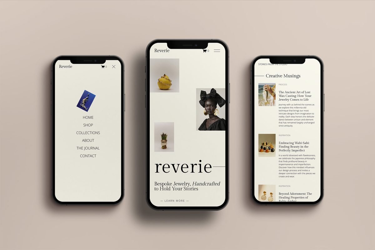
A mobile view for Reverie, showing the open navigation menu, homepage, and journal page, all condensed cleanly for a smaller screen. Thumb-friendly menu items, a clear hero message, and readable text throughout show what a mobile-first homepage can look like in practice.
Final thoughts on ecommerce homepage design
Hopefully these ecommerce website design tips give you a clear, actionable starting point. And it is worth remembering: best practices alone are never a magic bullet. Use these as a starting point, but how well your homepage performs will always depend on your product, your messaging, and a dozen other things beyond any checklist.
Your homepage's job, ultimately, is to make your craft and story impossible to miss. Your product, your vision, the way you see the world: that's what will make your homepage stand out.
Need help in creating a show-stopping homepage and website?
If you'd rather skip the trial and error, my guided one week Squarespace ecommerce package is built specifically for makers and small product-based businesses. Starting from the same base design referenced throughout this article, customised to feel entirely like you.
Frequently asked questions about Ecommerce Homepage Design Tips
-
Your homepage is the first, and often only, chance to make a case for your business before a customer decides whether to explore further. It typically includes a hero section with your value proposition, a curated selection of products, trust-building content like your story or process, and a clear call to action. Done well, an ecommerce homepage layout does more than list products. It builds a relationship with the person browsing it.
-
At minimum: a clear, personal value proposition, a strong hero image that reflects your craft, a curated selection of products (not your whole catalogue), some form of trust-building content beyond reviews — like your process or story — and one clear call to action.
These fundamentals of ecommerce homepage best practices apply at any scale, but for a small business, thoughtful execution matters more than having every possible feature.
-
Think of it as a journey. Above the fold: your value proposition and a hero image that reflects your craft. As visitors scroll: a curated product selection and trust-building story content. Further down: a single, clear call to action, and — often in the footer — a simple way for people to stay in touch. Good homepage structure guides a visitor naturally from first impression to next step.
-
The best ecommerce homepage design tips for a small or handmade business come down to a few key principles: lead with a personal, specific value proposition rather than generic promotions; keep navigation simple even if you offer more than one thing; feature a curated selection of products instead of your entire catalogue; build trust through your story and process, not just reviews; and make sure the site is easy for you to update yourself, so it doesn't eat into the time you'd rather spend making.
-
Start with clear goals, not features. A good ecommerce website design begins with knowing exactly what you want a visitor to do — shop, book a studio visit, or join a waitlist — and building every page around that single goal.
Choose a platform that lets you manage things yourself day-to-day — Squarespace is a solid option for most makers — and focus first on the essentials: a homepage, product pages, an about/story page, and a simple checkout flow. Following practical ecommerce homepage design tips from the outset, rather than big-brand playbooks, will save you from building features you don't actually need for a small, curated catalogue.
For more tips on how to build an ecommerce website from scratch, read this article.
-
For small, artisan-led businesses, the most innovative move isn't a flashy new feature, it's designing against the grain of big-brand conventions. That means swapping countdown timers and false urgency for honest, calmly designed scarcity cues (like a lead-time announcement bar). It means replacing a wall of reviews with process and story content. And it means treating self-editability as a design feature in its own right, not an afterthought.
-
Good ecommerce website structure starts with your core pages: a homepage, product or collection pages, an about/story page, and a simple path to checkout — plus whatever else your business actually needs, whether that's a bespoke enquiry page, a studio visit booking page, or a made-to-order guide. Each page should have one clear job, so a visitor always knows what to do next.
From there, structure is about hierarchy as much as pages. Your homepage sets the tone and guides visitors toward your most important next step; product pages need to build on that trust with clear images, descriptions, and pricing; and your navigation should reflect only the handful of paths that matter most, rather than mapping every category or offering you have. A simple rule of thumb: no more than seven navigation items, grouped by what your customer is actually looking for rather than how you internally organise your business.
Structure also isn't just about what's on the page — it's about how easy the whole site is to maintain. For a solo maker, a well-structured site means content blocks and templates you can reuse and update yourself, so adding a new collection or updating a made-to-order timeline doesn't mean starting from scratch each time.