
How do I know if my ecommerce website needs a redesign?
If you've found yourself wondering whether your ecommerce website is starting to look a little long in the tooth, you're not alone. Many small product-based businesses and makers grapple with these questions:
When is it time for a redesign? What are the warning signs? And how do I know whether a few simple updates will do or if I need a full redesign?
In this article, I've pulled together the most telling signs that it might be time for an ecommerce website redesign, as well as a few questions you can ask yourself to help figure out whether a full rebuild is really what you need, or whether something smaller would do the job. I'll also touch on what a redesign can realistically fix, and what it can't.
Table of Contents
How to tell your website has outgrown its current design
Your business and you have evolved
The beauty and magic of being a maker is that you are continually building on your craft and skills. As your abilities develop, so does your business. In this evolution and, let's be honest, in the daily demands of running a small business, we can easily forget to check in on our website and ask: does this still accurately tell the story of my business? Is it helping me meet my goals?
This is one of the most common reasons to consider an ecommerce website redesign. Not because something is necessarily broken in the technical sense, but because you and your business have grown, and your website simply hasn't kept up.
How this looks in practice will vary from maker to maker:
Perhaps you've moved into wholesale, commissions, or new sales channels, and your current site can't accommodate them without feeling cluttered, confusing or both.
Perhaps your branding has evolved (or you've rebranded entirely) but your website is still representing an older version of your business.
Or perhaps your product range has shifted significantly, with new work, new collections, or a different focus.
A good website should grow with you. When it stops reflecting where you are (and where you want to go), that's worth paying attention to.
Your data might have the answer
One of the clearest signs that your website might be due for an update is when your numbers start to tell you so. When I was running my own product-based business, this is one of the things I wish I had been more aware of earlier.
Regularly looking at the data that tells you how customers find and move through your website was not something I felt excited about and consequently neglected. But it is some of the most useful information available to you and hopefully, you are already watching this in your business.
If you're thinking “but I have no clue how to analyse this data”, the good news is you don’t need to be an expert to spot the warning signs. Most modern website builders include some form of built-in analytics (Squarespace’s is very solid), which gives you more than enough to work with. Here’s what to look out for:
High Bounce Rates
Your bounce rate is the percentage of visitors who land on your site and leave without clicking anywhere else.
If this number is high, it usually indicates that something about the first impression your site leaves is not quite working, whether that is poor navigation, unclear messaging, slow loading speed or imagery that doesn’t reflect the quality of your brand. If visitors to your digital store are not sticking around to explore, that is something you absolutely should look into.
Low Conversion Rates
Your conversion rate is the percentage of visitors who go on to complete a purchase.
If your site attracts visitors but they are not buying, it's often a sign of a user experience or trust issue, sometimes both.
On the user experience side, this might mean slow page loading times, a layout that doesn’t give visitors a clear sense of where to go next, or a site that doesn’t consider the mobile experience. Most shoppers now browse on their phones. If your site does not hold up on a small screen, that is a real cost to you, in customers who click away before they have even seen your work properly.
On the trust side, think about whether your site gives visitors enough reasons to feel confident buying from you:
Testimonials and customer reviews; media mentions, if you have them; high quality imagery and clear product description, easily findable FAQs and policies, and something that is so vital, especially for small artisanal businesses, yet often gets neglected - a clear sense of what you offer and why it matters.
Abandoned Cart
An abandoned cart is when a customer adds something to their basket but leaves before completing the purchase.
If your customers have gone to the length of adding something to their virtual basket but then do not actually complete the purchase, take some time to look at your check-out experience. The most common culprits for people to desert their shopping cart are a complicated and lengthy checkout process, asking customers to create an account before buying and unexpected costs - such as shipping fees - popping up too late in the purchase process. These are often some of the more fixable issues, so important to watch out for.
There are of course a lot of other data points you could look at, but these three are a good place to start because they are vital in assessing the health of your ecommerce website, they're some of the most accessible and often the most revealing.
Your website is difficult to update
If logging into your website has started to feel like a dreaded chore you keep putting off, that's a strong signal that it might be time for a redesign. Updating and maintaining a website is rarely the highlight of any maker's week, but it should at least feel manageable. When it doesn't, the consequences tend to compound quietly.
This is something I feel strongly about: website ownership is a form of creative and business autonomy and small business owners should be able to run their own website with confidence. Not just at launch, but day-to-day as their business evolves and changes.
When a site is built in a way that makes this difficult, makers often find themselves in a frustrating cycle: they avoid touching the site because they're worried about making things worse, and by leaving it untouched, the site slowly falls further behind the business it's supposed to represent and support.
Over time, this can mean relying on a web designer for changes that should be straightforward. This in turn adds both cost and friction to what is supposed to be a simple part of running your business.
If your ecommerce website feels more like an obstacle than an asset, then something needs to change.
Your website is hard to read or navigate for some visitors
Kind and considerate business practices extend to a website as well and ensuring it is set up so that all types of people have equal access to it, regardless of their abilities, is part of that.
Small text, low colour contrast, images without descriptive alt text, confusing heading structures, layouts that are difficult to navigate with a keyboard or a screen reader - these are all signs that your site may be excluding visitors without you realising it.
While there are measurable upsides to making accessibility part of a redesign, for example, it helps search engines like Google read your site more accurately, ultimately, the desire to see to the well-being and inclusion of our fellow humans in all their diversity should be the driving force.
If you are planning a brand refresh or rebrand, make sure to check your brand colours are inclusive (you can use a free tool for this) or talk to your brand designer about it from the start. That way, once you get to the ecommerce redesign phase, your web designer can start with a colour palette that is on-brand and meets accessibility standards.
Is an ecommerce website redesign the right next step?
You have checked in with your business goals and looked at the data. You know that your website needs to change. But how do you decide whether you can work with what you already have or whether it is better to start fresh?
This is often the most difficult part of the decision for small business owners, so let’s look at ways to distinguish between the two.
A refresh may be enough if:
Your branding has evolved but the overall site structure still works
Your pages simply need richer content or better imagery
Your copy needs updating to become more search-engine friendly
Your mobile experience needs attention but the site is otherwise still solid
You're generally happy with your site and just need things tidied up and brought current
A full redesign is likely needed if:
You are on an outdated version of your platform (for example, Squarespace 7.0) and the limitations are actively keeping your business stuck
The site has been patched so many times it has no coherent visual or structural through line
Your business has repositioned and the site no longer reflects who you are or what you offer
You are planning for long-term adaptability and growth, and your current site is not set up for it yet
What if your business sits somewhere in the middle? In those circumstances, a focused redesign of key pages (your homepage, your shop page, your product templates) might achieve most of what a full rebuild would.
Considering the above pointers can hopefully help you determine the right approach for your business.
What a redesign can and can't fix
A well-executed ecommerce website redesign can restore the alignment between your brand and your online presence, reduce friction for customers, and give you renewed confidence in what you are putting out into the world.
However, it's important to be aware of what a redesign cannot fix because this is a mistake that's easy to make, and one I made myself.
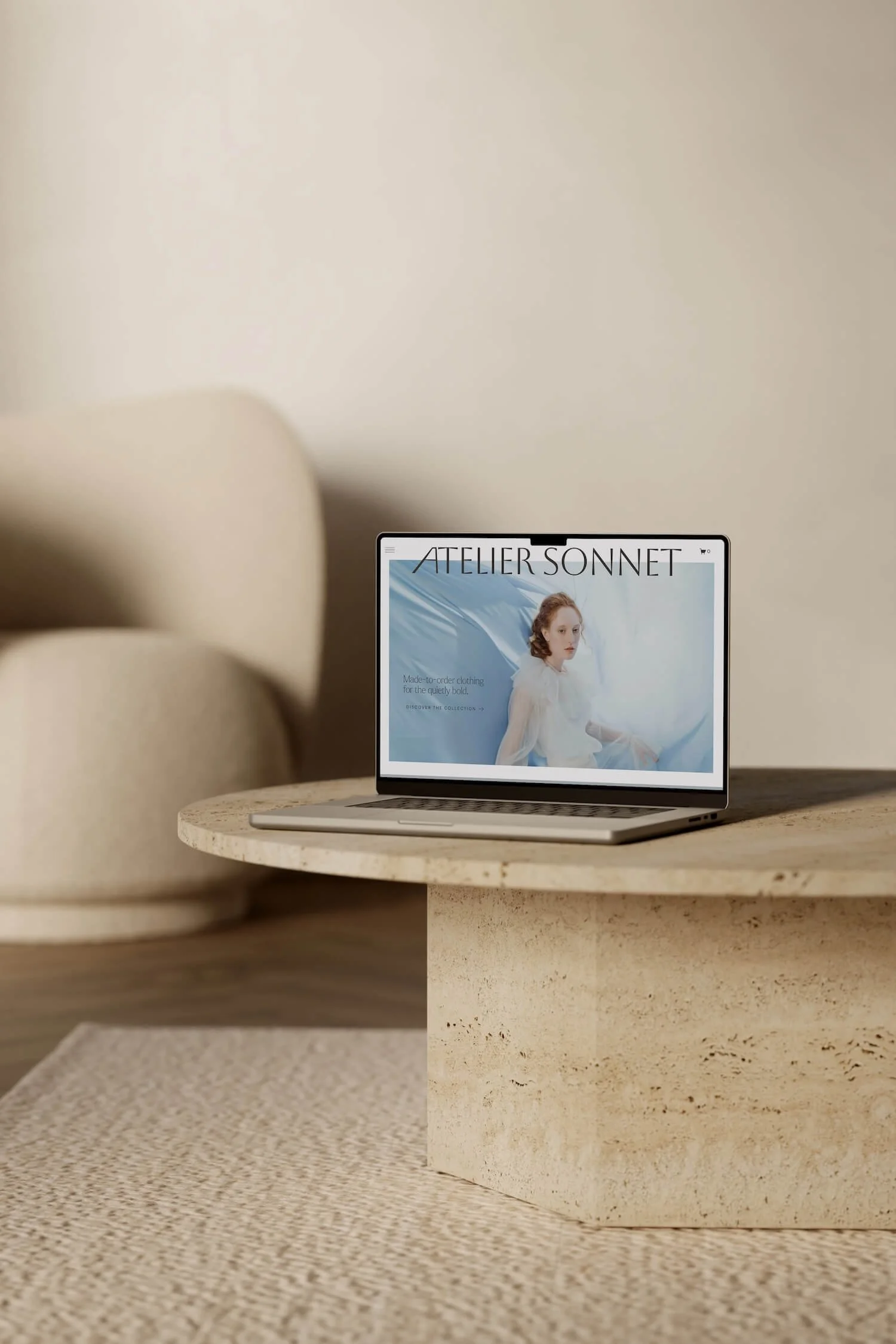
When I was running my made-to-order clothing brand, I spent a lot of time and energy focused on how my website looked. What I wasn't doing was asking the more important questions: what does this site need to do, and for whom? My design decisions weren't tied to clear goals, and as a result, the site looked good but didn't really serve my customers and, consequently, my business. It took me a while to understand that the problem wasn't the design, it was something much more foundational.
A new website will not fix a problem that is rooted elsewhere in your business. If your messaging is unclear, your pricing hasn't been thought through, your product range is still finding its shape, or your imagery is not of high quality, those same challenges will follow you to a new site.
This is why I encourage you to answer these questions before moving forward with a redesign:
Am I clear on who I'm designing this site for?
A website needs to represent you, but it ultimately exists to serve your customers. Every design decision - what content gets highlighted, how products are presented, where the calls to action sit - should be shaped by how your ideal customer moves through a site, not just by what feels right aesthetically.
Do I have defined goals for this site?
Beautiful and functional are not in opposition and the best ecommerce websites are both. Craft in its essence is defined by the marriage of utility and aesthetic value. Just as your unique objects are intended for use as well as visual pleasure, so is your website. Knowing what you want your site to do (sell a specific product, attract wholesale enquiries, build your newsletter list, etc.) gives every design decision a clear purpose.
The more clarity and purpose you bring to a redesign, the more the project will actually deliver.
Ready to breathe new life into your ecommerce website?
I would love to support you! I build calm, beautiful, strategic Squarespace e-commerce websites for makers and artisans, helping you bridge the gap between craft and commerce in a way that is kind and considerate to people and the planet.
Frequently asked questions about an ecommerce website redesign
-
The clearest signs are a drop in sales or enquiries, a high bounce rate, a site that is difficult to update, and a design that no longer reflects your business. And if you feel embarrassed sending people to your own website, that’s definitely a sign you should take note of too.
-
There's no fixed rule, but most small product-based businesses benefit from revisiting their website every two to four years. An redesign makes the most sense when your brand has evolved, your product range has grown significantly, or your current site is actively getting in the way of sales. If it still looks and functions the way you want it to, there is no need to change it.
-
A refresh typically involves updating colours, fonts, imagery, or copy within your existing structure. A full rebuild means starting from a new layout or template entirely, which makes sense when the underlying structure no longer serves your business. And some businesses find the answer somewhere in between: a targeted refresh of key pages rather than a full rebuild.
-
It will depend on your business’s unique situation but if your current site doesn’t serve your business goals any more, is still using Squarespace 7.0, or doesn't convert visitors into customers, then it can definitely. A well-executed Squarespace ecommerce redesign doesn't have to be expensive or time-consuming. A structured service like a one-week website build makes this accessible for small creative businesses without the cost or time-investment of a fully custom project.
-
Costs vary widely. A template-based redesign typically sits in the range of a few thousand Swiss francs or equivalent. A fully custom build will cost significantly more. An important question to ask yourself is: what is your current website costing you in lost sales, lost time, and the effort of DIY workarounds? That context usually makes the investment feel much clearer.
-
Not necessarily. While a platform migration can temporarily impact rankings, a strategic redesign will include steps to minimize that.
Setting up proper redirects for any URL changes to key pages is essential. This will tell search engines that a page has moved permanently and passes the SEO value from the old URL to the new one.
A strategic, well thought-through redesign can actually improve your rankings over time. Faster load speeds, a cleaner site structure, better mobile experience, and properly formatted page titles and descriptions all contribute positively to how Google reads your site.
If SEO is something you have invested in, bring it up early in any conversation with your web designer. It's much easier to protect than to rebuild after the fact.
-
Here are the most important things to have ready before you begin: a clear sense of who your ideal customer is and what you want them to do on the site; high-quality product photography; a consistent brand identity (logo, colours, fonts); and all the written content (i.e. copy), Being prepared makes for a smoother redesign process and ensures your new site will be functional, beautiful and strategic.